What a chart is
Every trading day, a stock opens at one price, moves around, and closes at another. A chart draws that, day after day, as a line or a row of candles. Look at a year of it and you see the shape of the story: the long slide, the sharp recovery, the months of going nowhere.
The chart does not tell you why any of it happened. It tells you what the market did about it. That is a different kind of information from a results filing, and worth having beside it.
The problem with most chart tools
Charting software is built for full-time traders. Fifty indicators, a hundred settings, and a stock that lives on its own, away from its results, its filings and your list of companies. Beginners open it once, feel lost, and go back to the price on Google.
Charts on StockScans starts simple. One stock, daily candles, volume underneath. Everything else is a click away when you want it, and the company's results and dividends are already marked on the chart.
Reading the page
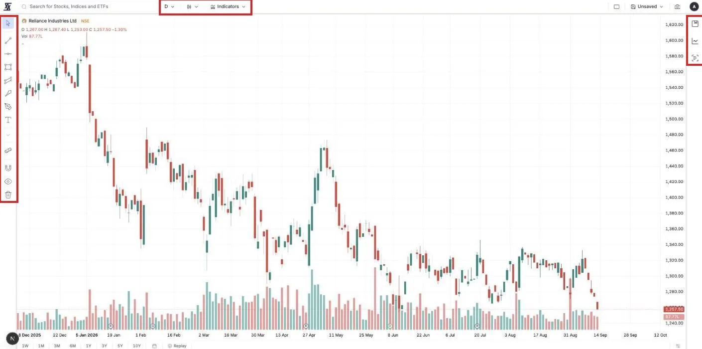
Open Charts from the top menu, or press the chart button that appears when you hover any company name on the site. The address is the company's symbol, so /charts/NSE:TCS is always that company's chart.
Each candle is one day. Green means it closed higher than it opened, red means lower. The thin lines above and below are the day's high and low. The bars along the bottom are volume, how many shares changed hands. A big red candle on big volume is a day when a lot of people decided to sell.
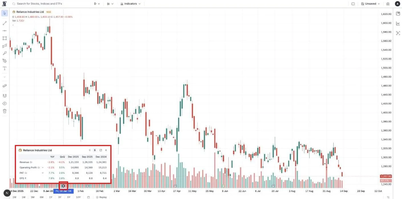
The small circles along the bottom edge are the company's own events. R is a results day, D a dividend, S a split, B a buyback. Click an R and the quarter's numbers open right there: revenue, profit, EPS, with the change against last year. You can see what the result was and what the price did about it, on the same screen.
Zooming in and out
The D button at the top changes the timeframe. Daily is the default and the right place to start. Weekly and monthly compress years into a screen and show the long trend. Minutes and hours show a single day in detail. Prices update about once a minute while the market is open.
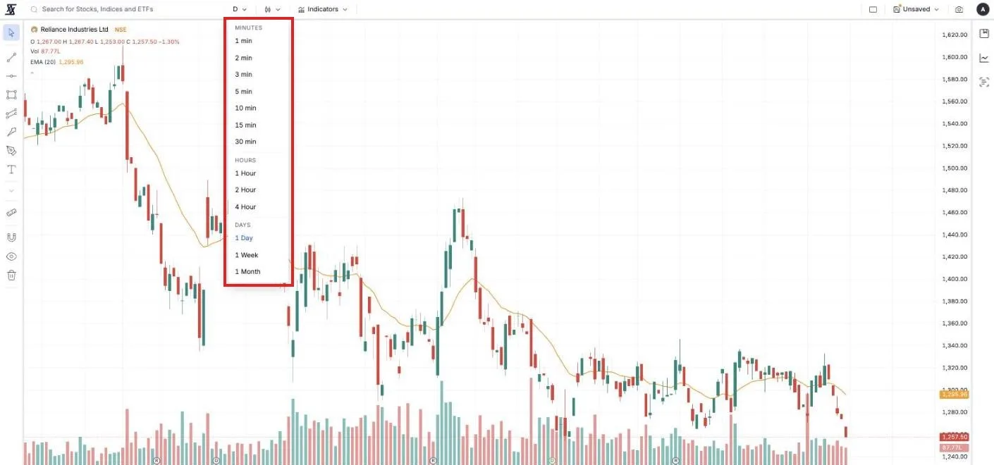
The buttons at the bottom, 1W to 10Y, jump the view to that range. Daily history goes back to the year 2000, so 10Y is real.
Changing what the chart looks like
The button next to the timeframe picks the chart type. Candles are the default. Line is the simplest, just the closing price, and the easiest to read when you are starting. Heikin-Ashi smooths candles so trends are easier to see. Renko, Kagi and Point & Figure are for people who already know they want them.
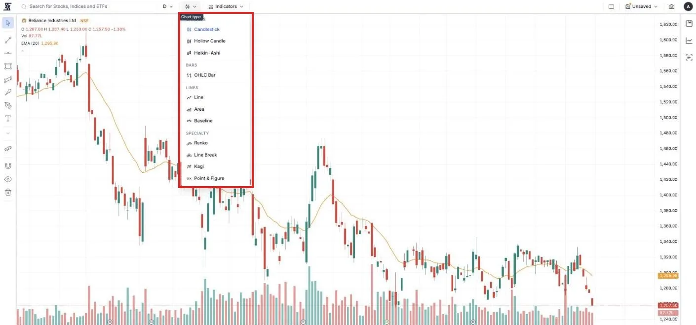
Indicators, and the two worth starting with
An indicator is a calculation drawn on top of the price. Press Indicators and search. There are over thirty, from the standard moving averages, RSI, MACD and Bollinger Bands, to a few written for StockScans, like Relative Strength against the broader market and the SOIC Long Term Indicator.
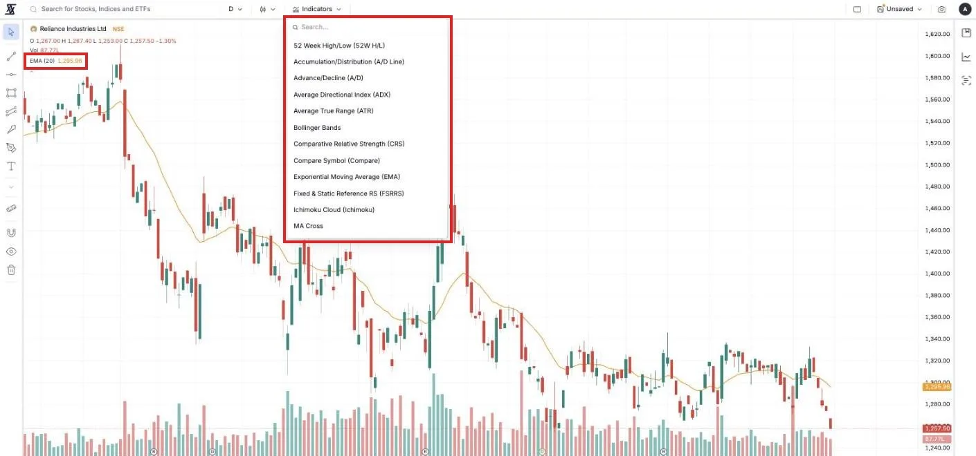
Two are enough to begin with. A moving average draws the average price over the last so many days as a smooth line. Price above the line is a stock in an uptrend, below is a downtrend, and that one line answers "is this going up or down" faster than staring at candles. Compare Symbol draws a second stock or an index on the same chart, so "did this beat the Nifty this year" is a glance.
Every indicator has settings you can edit, and each one can be removed with one click.
Drawing on the chart
The tools on the left rail let you mark the chart. Trendline joins two points. Horizontal Line marks a price. Rectangle boxes a range. There are fifteen tools, including Fibonacci levels and a ruler that measures the percentage move between two points.
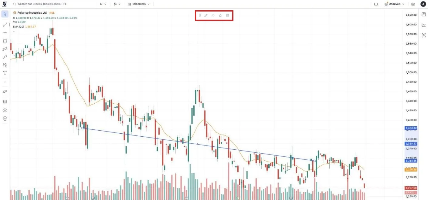
Drawings are saved with the stock. Come back next month, on another device, and the lines are still there.
An alert on a line, not a number
This is the part that is hard to do anywhere else. Draw a trendline under a stock's recent lows. Click it, press the bell, and choose Crossing Down. Then close the tab.
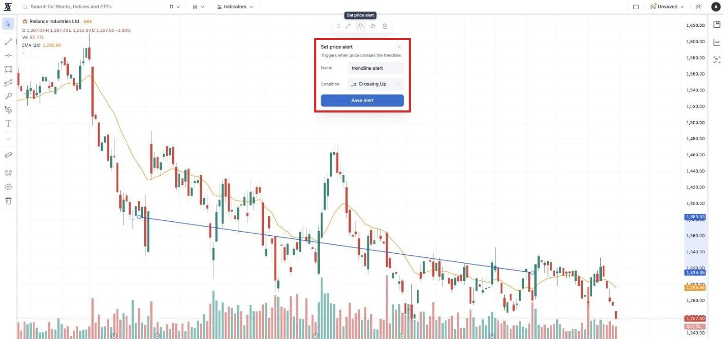
From then on the line is checked every minute the market is open. When the price breaks through it, one message arrives by email or Telegram. A sloping line means the alert level moves every day on its own, which a normal price alert cannot do. It works on trendlines, channels and rectangles, and re-arms each day, so a line that keeps getting tested keeps telling you.
Right-click for everything else
Right-click anywhere on the price and a short menu appears. Quick Fundamentals opens the company's statements in a small window over the chart. Add to Watchlist, Notes and Set Alert at this price do what they say. Draw Horizontal Line here drops a line at the exact price under the cursor.
More than one chart at once
The grid button at the top right splits the screen into two, four, or up to nine charts. Put the stock beside its biggest competitor and the sector index and read all three on one screen. Sync toggles keep the timeframe, crosshair and time range moving together across the grid.
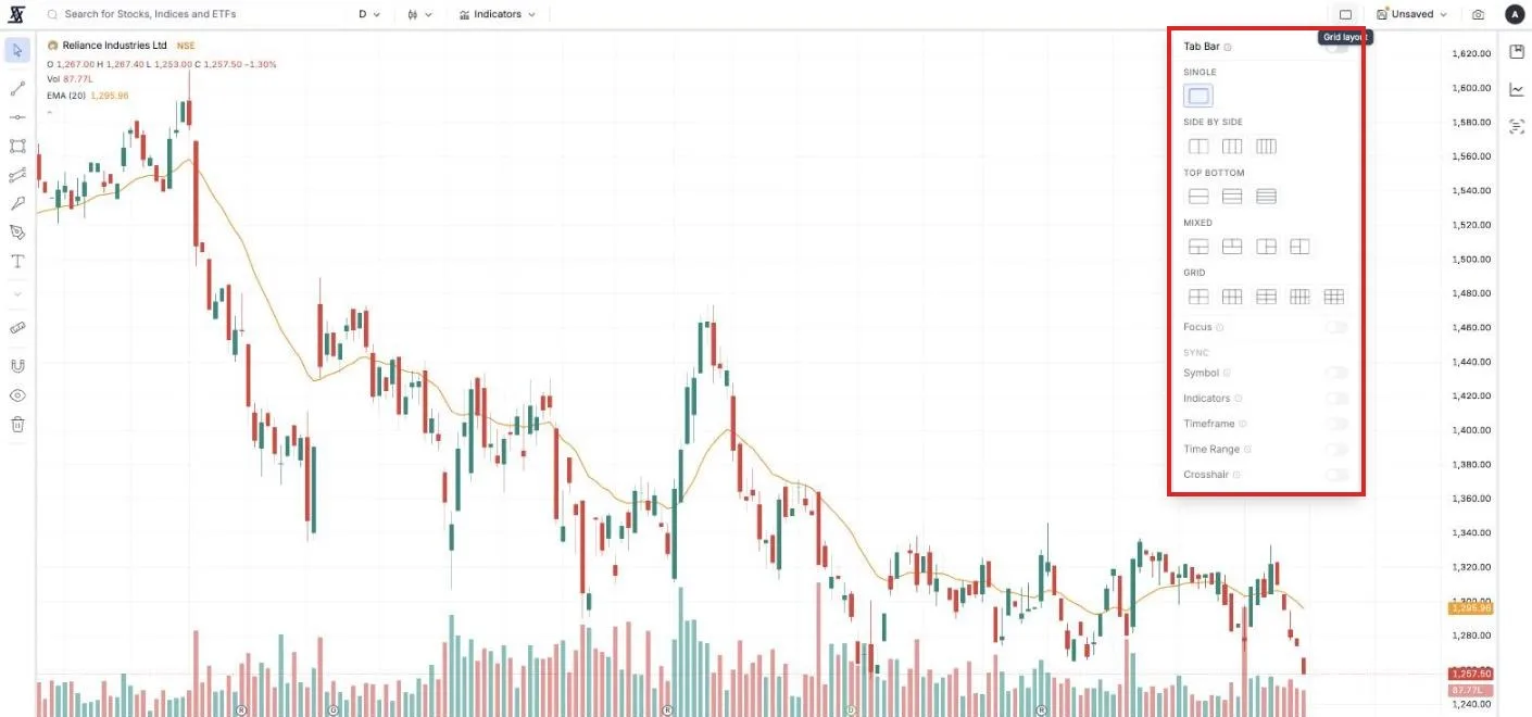
A layout saves the whole arrangement: which stocks, which timeframe, which indicators, which grid. Press New Layout under the Layouts button, name it, and it saves itself as you work. Open the chart on another device and the same layout is waiting.
Your scans and watchlist, beside the chart
The three icons on the far right open panels. Watchlist lists your companies. Custom Index lists your indexes. Stock Scans runs any of your saved scans, or the built-in ones, and lists the matches.
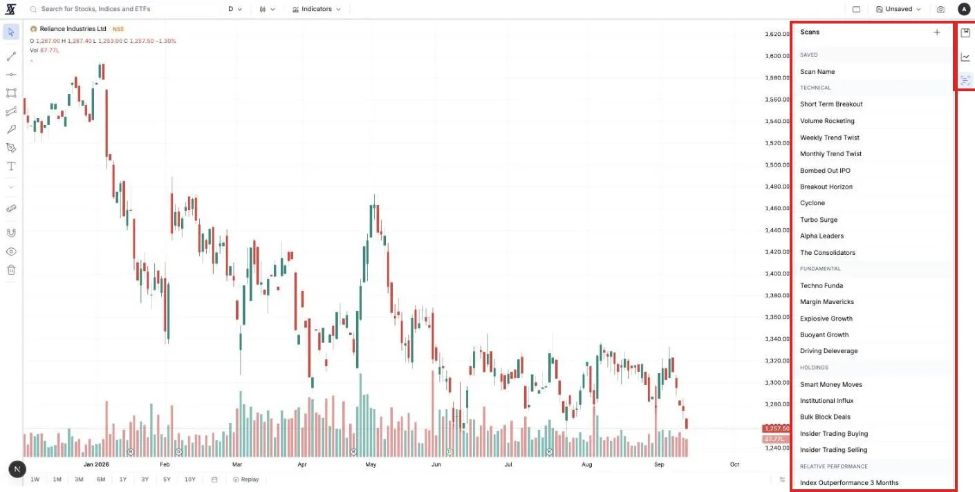
Click a row and the chart switches to that company. Press the down arrow and it steps to the next one. Running a scan that returns forty stocks and stepping through their charts with one key is the fastest way to turn a list into a shortlist.
Small things you will use
Replay rewinds the chart to any past day and plays the candles forward one at a time. Pick a date before a result, cover the future, and see whether you would have read it right.
The camera button copies the chart, downloads it, or lets you select an area. A small bar then offers to share it to X, WhatsApp or Telegram.
Press Shift and ? for the full list of keyboard shortcuts.
What is free
The chart itself. Any company, index or ETF, every timeframe and chart type, events on the chart, Quick Fundamentals and the panels. No account needed to look.
Two indicators, five drawings, five drawing alerts and one saved layout, with a free account.
Premium raises those to five indicators, thirty drawings, fifty drawing alerts, three layouts and a four-chart grid. Premium Plus doubles most of them again and allows nine charts on one screen.
Three things to do this week
One company you own. Open its chart on weekly. Add one moving average. Is the price above or below it, and for how long?
One result. Find the last R marker on a stock you follow. Click it. Look at what the numbers were, then at what the candles did in the week after.
One line. Draw a trendline under the last three lows of a stock you are watching. Set Crossing Down on it. Forget about it until it writes to you.
The price was always moving. Now you can see where.
Comments