
What a quarterly result is
Four times a year, every listed company has to publish how it did in the last three months. Revenue. Operating profit. Net profit. Earnings per share.
The numbers themselves tell you little. A company earning 100 crore is not better than one earning 10 crore. What matters is the change. Did revenue grow compared to the same quarter last year? Did profit grow faster than revenue? That is what moves a stock the morning after.
So each result is really two numbers per line: the level, and the growth.
The problem with results season
Results arrive in a bunch. Around 1,500 companies report within about six weeks, and the busiest days see over a hundred.
Following even twenty companies means opening twenty PDFs, finding the same-quarter-last-year figure in each, working out the growth, and doing it again next quarter. Most people give up and read the headlines instead. Headlines cover the fifty largest companies. The small company that just doubled its profit gets no headline at all.
Result Scans does the arithmetic for every company that has reported, and shows them as they land.
Reading one card
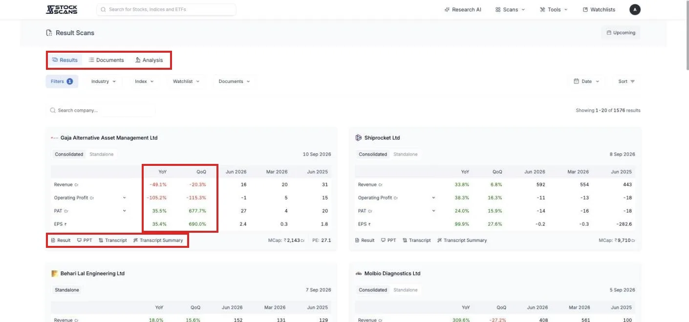
Open Scans in the top menu and choose Result Scans. The page is a grid of cards, one per company, with the most recently declared at the top. Each card is the same shape.
At the top, the company and the date it reported. Then a small table. The rows are Revenue, Operating Profit, PAT and EPS. The three right-hand columns are the latest quarter, the quarter before, and the same quarter a year ago, so you can see the level with your own eyes.
The two left-hand columns are the ones to read first. YoY is growth against the same quarter last year. QoQ is growth against the quarter before. Green means up, red means down. YoY is the fairer comparison for most businesses, since it removes the season. QoQ tells you whether the latest quarter turned.
Click the small arrow next to Operating Profit or PAT and two more rows appear: OPM and NPM, the margins. A company whose profit grows faster than its revenue is getting more efficient, and margin is where you see it.
If a company reports both consolidated and standalone numbers, a toggle at the top of the card switches between them.
The documents behind the numbers
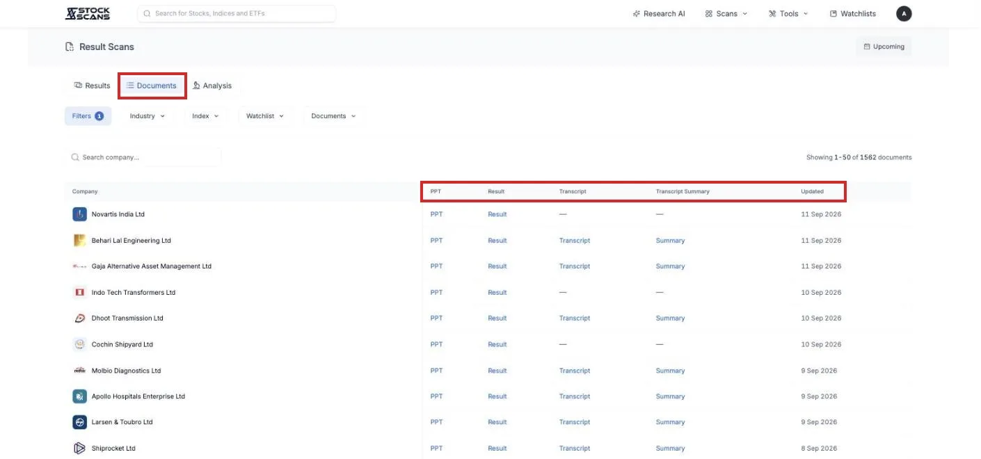
At the bottom of each card sit links to the source: Result opens the filed PDF, PPT the investor presentation, Transcript the earnings call, and Transcript Summary a written summary of that call. All of them are one click from the card, so a number that surprises you can be checked in the company's own words.
There is a Documents tab above the grid that lists exactly these, one row per company, for the whole quarter. Useful when you want to read presentations rather than compare numbers.
Finding the growers
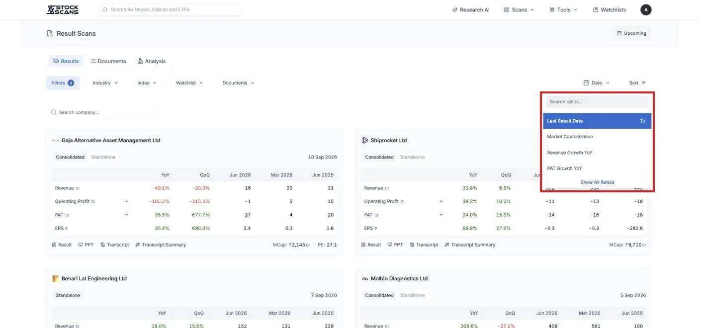
By default the cards are sorted by the time the result was declared, so the page reads like a live feed during the season. Come back at four in the afternoon and the top of the page is what came out in the last hour.
Sort changes the question. Sort by Revenue Growth YoY or PAT Growth YoY and the fastest growers of the quarter rise to the top, regardless of size or fame. Press Show All Ratios and you can sort by any of the 300 or so numbers StockScans keeps, market cap, return on capital, price to earnings.
Narrowing the grid
The buttons under the tabs narrow which companies you see.
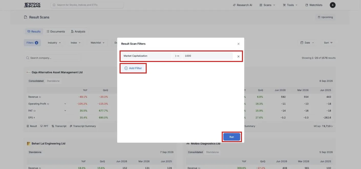
Filters works like a stock scan. The page starts with one condition, market capitalisation of at least 1,000 crore, to keep the very smallest names out. Change it, or add conditions, and only companies that pass are shown.
Industry, Index and Watchlist limit the grid to companies you care about. Set Watchlist to your own and results season becomes a page about your portfolio, in the order your companies report.
Documents keeps only companies whose earnings call transcript or summary is available, for when you want to read what management said rather than just the numbers.
Date picks a single day. Which companies reported on Tuesday? The calendar only offers days on which results actually came out.
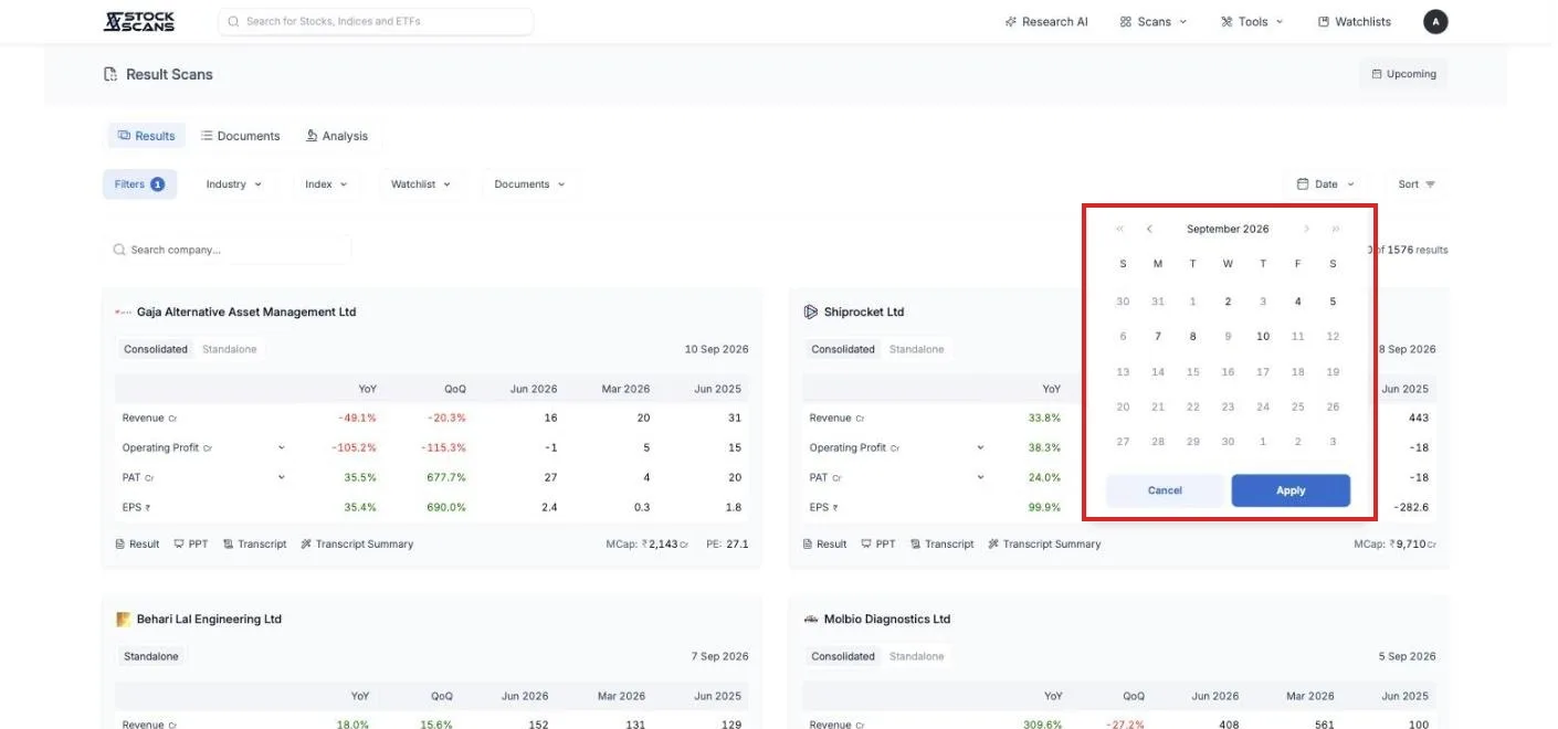
Search company finds one company by name.
Is it just my stocks, or everyone?
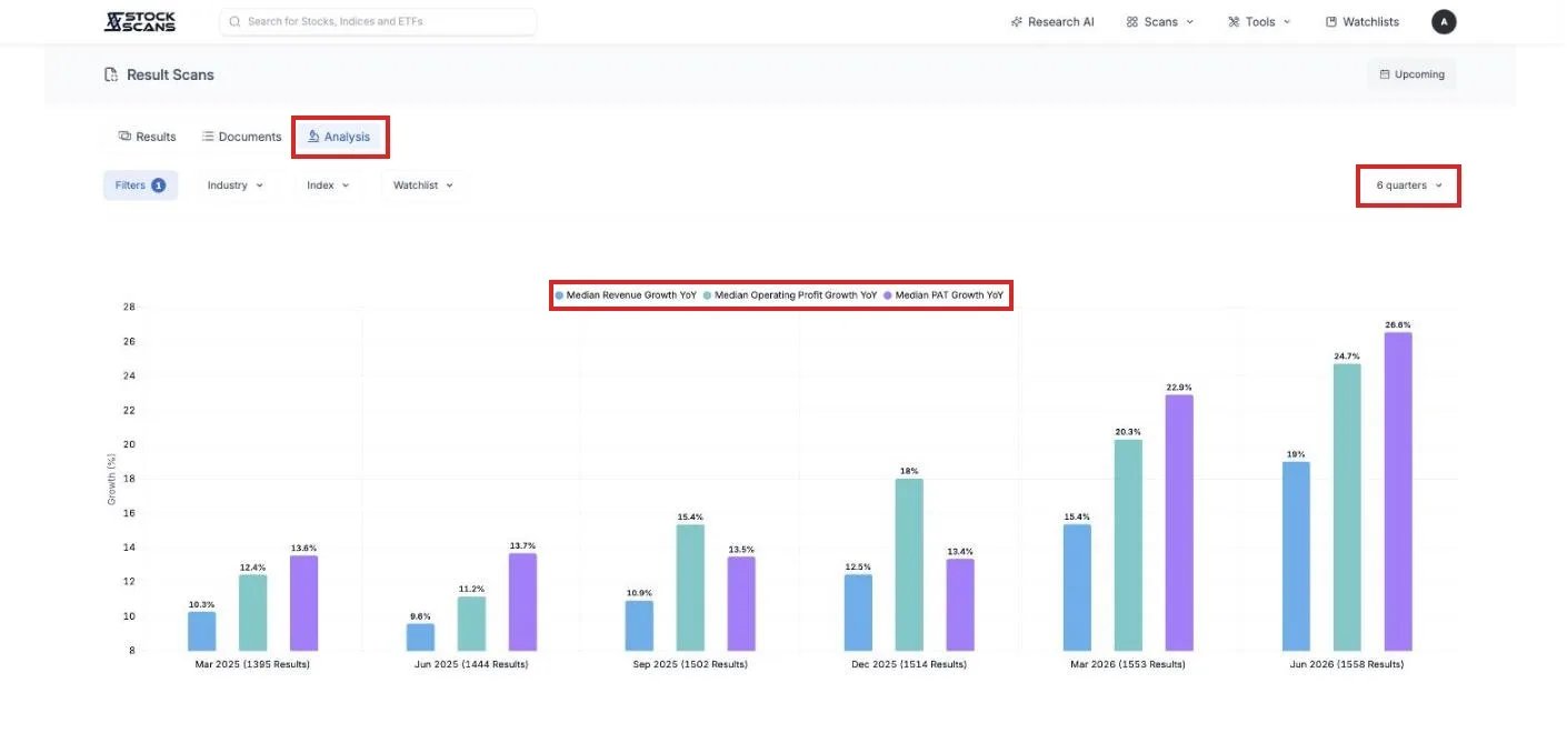
A company growing 15 percent looks good until you learn that its whole industry grew 25. The Analysis tab answers that in one chart.
It takes every company matching your current filters and plots the median growth in revenue, operating profit and profit, quarter by quarter, for the last six quarters or up to twenty. Set Industry to pharma and you see whether pharma as a whole is accelerating. Set Watchlist to yours and you see how your portfolio's quarter compares to the market's.
Who reports next
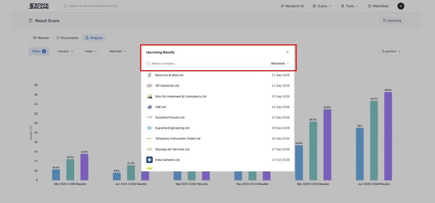
The Upcoming button in the top corner opens a list of companies with their next result date, soonest first. Filter it to your watchlist and you have your calendar for the coming weeks.
If you want to be told rather than check, turn on alerts for a watchlist. When any of its companies declares, the result card arrives by email or Telegram.
What is free
The grid. Every company that has reported, with growth worked out, and the source documents linked.
Sort. By declaration time, or by any growth number or ratio.
Search and Upcoming. Find a company, see who reports next.
One filter condition. Enough to set a size floor.
Premium opens the rest. Filters without limit, the Industry, Index and Watchlist scopes, the Date picker, and the Analysis chart that tells you whether a quarter was good for everyone or just for you.
Three ways to use it this season
The daily check. Once a day during the season, open the page. Read the top ten cards. That is what reported since yesterday, growth already computed.
Your own quarter. Watchlist set to yours. As each holding reports, its card appears. Open the transcript summary for anything that surprised you.
The hunt. Sort by PAT Growth YoY, Filters at market cap under 5,000 crore. The small companies with the best quarter, before anyone writes about them.
Open it on the next results day. The season will feel very different.
Comments